CONTENTS PAGE USING PHOTOSHOP
- Feb 4, 2017
- 3 min read

To begin my contents page editing using photoshop, I did similar stages to the previously talked about adding a A4 international document with a black background, i added the layouts with opacity down so i had some structure to my design ideas to keep things in place i also used "guides" on photoshop which are blue lines that will not appear on the final outcome but help with things such as keep text in line and columns.

I then followed this layout much more restrained than the last, adding rectangle boxes in place of the layout.


after this i added the aspects i could carry over from the front page and was solid on the choice of the title "contents" and the font of that.

I then added yellow "banner" section breakers to split up/divide my rectangular blocks.

After this I decided on the actual text to put in the banners, i had already roughly planned this text but needed to make some decisions on which are most appropriate, i did this by looking at previous magazines such as already studied in my textual analysis's - terrorizer, Q and Kerrang and decided the most suitable would be
NEWS
REVIEW
WIN
and a more central poster banner also... but then also needed to fit my features in, but decided it would look to crammed and un-professional looking to include them in this section, therefore combined two draft layout ideas/concepts of adding a horizontal rectangle for the features.


I then added the page number text on the bottom right of the page, i would consider this a form and convention so tried to be quite formal and structured in the way this was presented adding the date, the masthead/name of the magazine, and the page number i did all of these in the masthead font as i though this would keep a professional aspect of the magazine carrying through the identity of the magazine, i used seperate colours for each section of this text to make them easier to identify.

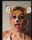
After this i added form and convention the editiorial letter, this is visible in most magazines, I looked at pre-exsiting example of this component of the magazine before attmepting my own, most music magazines of this genre have a more personal approach of a editioral etter with very informal inclusive language and a funny photograph, so for this i took a selfie of my self with a funny "filter" from social media app snapchat and wrote a personal letter, i downloaded a handwriting font from dafont.com and used this for the "sign spot".

I then added the posters again, Placing them in the same style on the vertical text rectangle, much bigger also i did this for a better look a for the viewer at the posters, also to fill some space.

i then added the "features" banner, artist names and page numbers i had noticed in other magazines, the size of these things change but format the same, being page number being the biggest size, artist name being the next biggest and the actual text being smallest, then added the text about each artist.

I then added the images, my original plan was to have one photo as the main photo but then i decided against this and used an image from shoot i did, I was going to then have these in boxes but decided to free form them and use the eraser tool to go round them, i then added these images in their appropriate positions adding adjustment layers to brighten and make them standout and not drowned out such as levels and exposure, i also used layer links which is where you link layers to specific layer and not everything underneath.


Finally, when i thought i had completed my contents page i asked for feedback via feedback sheets and teacher/media student opinions, Grace the photoshop teacher, suggested I added a subscription banner in a big empty space at the bottom left of the page, i did this by adding text, a banner and a screenshot of the front cover as i had previously seen this done before

The other feedback i was given by fellow student tiffany cooper was to lengthen my artist text so i increased this to fill space.


Comments