
Fonts - front cover, contents page and double page spread
- Nov 22, 2016
- 1 min read
I spent this lesson downloading fonts from dafont.com ( an archive of freely downloadable fonts). i explored a variety of font genre's:
Fancy - cartoon/comic/groovy/eroded/distorted/destroy/horror (i was thinking perhaps these for mastheads and cover lines)
Techno - various
Gothic - modern
Dingbats - horror (skulls for bullet points or section breakers)
I have downloaded a selection of fonts, some simpler fonts for cover lines and some more complex fonts to connote the genre for mastheads.
FRONT COVER

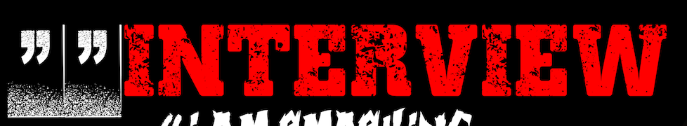
i picked 'Crackvetica' for my masthead because it is similar but not exact to pre exsisting rock magazines it connotes the genre well and adds theme to the magazine.


i picked 'Vtks LongTime' for my cover lines because this font was a similar style to the masthead but shows slight differentiation, this follows most codes and conventions.

i picked 'skullx' for section breakers I did these so they break up the text more but still keeping to the genre connoting in a creative way.


i picked 'Spacesuit' for a small section of text saying 'special edition' I did these so there was some diversity in the text similar to use in the pre existing mag
azine Kerrang.


This

CONTENTS PAGE


DOUBLE PAGE SPREAD


Comments