
Elisha Fall
as media: foundation portfolio
Contents Page
Textual Analysis


Contents Page Textual Analysis 1 - Terrorizer
Layout - The layout of Terrorizer's one page contents page has a very structured appearance as it is well organised although uses a different colour scheme than the front. The contents page has all features expected of the contents page. It has articles, a a main article and smaller articles and a main image and smaller image, page numbers. As the page is so structured this means the information is very easy to scan through and look for what it is your trying to find. The page index takes up most of the page unlike the other contents pages.
Headline - The headline/ main article is about “‘Bloodstock”, this could be to connote the nature of the magazine, as the magazine name is terrorizor which is of similar savagery to the word "bloodstock". You can see this is a significant part of the contents page by the size of the image and amount of room designated to it. This headline is also different from the front covers headline.
Font choice and size - The font used is all very similar but slightly different. again using simpler fonts than the front cover as it is a important part and needs to be clear and easy to read. They have put the title as such of each page in bold grey writing and summary/description of the page in smaller non bold black writing, important titles such as “Contents” and “Regulars”/“Features” are in a similar scratchy writing to the mast head i believe this is used to connote the rock genre similar to the way Kerrang does with its broken font.
Images - There are only two images on this page which shows that these images are of importance. one image is related to the main story and you can tell this again as it is the largest and the consumer needs to pay the most attention to it. the other image is of a smaller article. this shows the magazine is dedicated to promoting the music and not the superficial business of the music industry as its audience is older again. Both article images feature pictures of the artists, both doing/wearing very stereotypical rock clothing/makeup/gestures.
Colour scheme - The colour scheme of this contents page is very simple as it barely using colour and is very monotone. which fits and connotes the rock genre well, The images used are dark and the colours are very miminal, being, white and variations of grey and black, the colour black is associated with death, evil, and mystery, Rock has strong links with these themes.
Target Audience - As the contents page does have this minimalistic look it could be questionable who it is directed at as no gender specific colours are used, although bu the lack of ads and promotion which are commonly aimed at young people, and the chose of artists featured being much older and giving the appearance of a older more "traditional" look of the rock genre, it could suggest this is the intended target age.
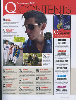
Contents Page Textual Analysis 2 - Q Magazine (1)
Layout - The contents page of Q magazine includes all codes and conventions of the traditional contents page of a rock music magazine/music magazine in general, This could be a representation of the company's professionalism, This Contents page has a main image, and also smaller images, multiple small stories, advert, date and page number. These are all organised into a structured page, featuring features on the left, in the lower middle is the other page numbers and the upper half is the main feature and connoting image.
Headline - There is a clear Main Headline/ Story, you can tell this by the size of the image (being the largest image). This Main Story is on the band the arctic monkeys and has a some text you would expect the text to connote this image to be bigger or stand out but it is the same size as the other text on the regulars side of the page.
Font choice and size - In Q magazine the font used on the contents page is similar to the other magazines, but set out in a more interesting manor, with large page numbers and more classic small text, also the Header is a font unlike any other used in the other rock magazines you would expect to see this font used in a different genre music magazine, as it is very thin and more elegant looking than other rock magazines smashed and cracked fonts, This could be to show the magazines focus on "lighter" rock artists, not as heavy as other rock magazines, also perhaps to show the target audiences this aswell, that its for a more lighter readers of the rock genre and perhaps with its elegancy this could be trying to attract female viewing.
Images - On this Q contents page, there is 4 images, each image connotes an article heading. Their is quite the variety of images on the page each connote a lighter side of rock by using nature backgrounds and white clothes to black shades and gig shots. In this case, the main image and the main image on the front match in this case. 3 out of the 4 images have backgrounds, the main image inlays does not and overlays of the header, perhaps to show this is a more important image.
Colour scheme - The colour scheme on this magazine contents page is very different from other rock magazine contents pages, in the way of colour schemes. Instead of using the dark colours other rock magazines use, Q goes for a lighter look to rock maybe to connote lighter rock music. It uses pastel colours and drowned out colours such as reds, light blues and purply tones, these are perhaps to further connote the light rock music also these are stereotypical female specific colours. The Red connotes the brands identity and front cover, the more important parts are in red and black and the sub heading are in banners of pastels. I think the important parts are in red, as the publisher presumes the consumer will relate the logo’s red to importance and therefore the other red parts will be important. The background remains white i believe this is to keep the reader’s attention focused on the text.
Target Audience - The target audience is hard to identify, although as most images feature predominantly male acts i believe it is targets at the male audience although its pastel colours could suggest a female target. The age of the target audience is slightly more clearer i believe the target age group is young adults and adults, i think this as the simpler maturer set out is not really aimed at teens and from the images the bands look fairly young but not too young perhaps in their 20’s and 30’s, I believe this through the use of younger artists.
Contents Page Textual Analysis 3 - Kerrang
Image - On this contents page there is 6 images overall, one is to go with the main article and is by far the biggest image, it is of Metallica featuring in a picture with a fan, with their world tour sign, one of the band members is pulling a angry face with the commonly known as “rock gesture”, the majority of the photo is black which connotes the rock genre as it is usually associated with the colour. the other images are of the editors to go with the editorial letter, this gives a personal feel to the contents page, making the consumer feel important, This could also be a way to entice people as by having a photograph showing a band with a crowd of fans around them shows the reader they must be popular and therefore they may be more likely to look at this magazine by also showing the crowd this shows the reader that the fans of this magazine are connected to it more personally then perhaps another rock magazine, The Copy image of the front cover and 3 images of the posters inside the magazine.
Layout - The one page contents page to this issue of Kerrang is vastly different to its front cover, the front cover was very busy with little space used whereas the contents page uses very little text and big amounts of space, almost 2/3 of the page in fact, although this leaves questions as to the quality of what else is on the page it is surprisingly structured. The contents page has all of the features that would be expected of a contents page of a music magazine including a editorial letter. you can quickly identity what the main story is in the magazine as the image supporting the story (which is a fan selfie picture of Metallica outside their world wide tour sign) takes up two thirds of the page. it is also uncommonly the only page number with a image, other articles and page numbers are featured on the right under sub sections such as News, Features, Lives, Reviews, Gigs. The Page also features posters and a copy image of the cover.
Headline/Main Feature - The Headline for this issues contents page is about Metallica's world tour. it is clearly the headliner as it dominates the page and is the only article with a picture, the image is mostly black which goes with half of the colour scheme of the page. This headline is also different from the front covers headline.
Font choice and size - There isn't as much a variety of fonts on this page compared to the cover. The font is used to write “Contents” is similar to font used on the front cover of the magazine, apart from this simple bold writing is used for titles and simple writing un bold for everything under sections, i believe this is because the contents page is a important part of the magazine and therefore needs to be clear and easy to understand.
Colour scheme - The colour scheme of this contents page is completely different to that of the front cover, Black and Yellow are the colour scheme used on this page. These are colours that are generally used in rock magazines, go with the border of the magazine which yellow and black caution tape, perhaps to give the consumer a feeling of what coming ahead is shocking.
Target Audience - The target audience is still as the cover majoritly younger audiences you can see this by the use of doodles around the bubbly font, and posters advertised, also the use of sections such as gigs, as younger audiences are likely to attend these rather than older audiences, although the band Metallica who is the main headline of the page is a older band leading to thinking that maybe this is for older audiences.